UNDERSTANDING TYPOGRAPHY AND TYPEFACE
Look around you, what do you see? Maybe the poster on your wall or the fact that you’re reading this right now. That’s typography! When you first see the title of a thriller movie, it probably has bright colors with scary effects. This sets you up for what to expect from the movie.

Typography is used to show emotions, and tones to help you communicate more efficiently. If you’re someone who’s been wanting to dive deeper and understand better what typography and typeface mean, you’re reading just the right blog!
WHAT IS THE MEANING OF TYPOGRAPHY?
The art and process of arranging text to make your content seem appealing, understandable, and legible is called typography. Doesn’t matter if it’s digital or printed, typography is responsible for the way any text is presented to your audience. Changing the layout, including font size, font styles, spacing, and alignment are all important parts of typography.
The way you read something in your mind depends largely upon the tone and expectation of the content and typography does just that. It helps set the tone and is a first impression on the reader.
Fun fact: Typography’s meaning is derived from Greek words – typos meaning “impression” and graphein meaning “writing” which suggests that it is the first impression of writing.
To understand the process of typography in a deeper sense let’s first look at why typography is so important.
IMPORTANCE OF TYPOGRAPHY
Typography doesn’t just make your text look pretty, it is also significant in graphic design, web design, and especially user interface design. The right text and font are important for all designers to make their overall work look captivating. The importance of typography is emphasised in not just aspects of design but also marketing.
Here are a few reasons why that is:
- It builds your brand reputation. Your audience starts to associate your typography with your brand. It gives you a personality and brings you the right recognition.
For instance, just reading the word “Gucci ” in a different font on a product will help you decide if it belongs to the actual brand or company, or if it’s a knockoff. All brands have different fonts and styles to make them unique and distinguishable.
- For areas like graphic design, typography pieces everything together. It is a very important part of designing as the text has to complement the other elements on your website. The look of your page should be attractive and engaging, which is why cracking typography plays a vital role for graphic designers. For example, a jarring font will rarely, if ever catch the reader’s eye.
- It helps communicate your message to your target audience. Different situations require different fonts.
For example, If you want to put up a sale sign, the correct way to do so would be very different from putting up a notice to ask people to invest in your business.
Did you know?
For formal and professional letters, the general public prefers Arial, Calibri, and Times New Roman with the size of 10-12.
It makes one look specific and serious about your work. These specifications go a long way for your audience and their decision-making powers.
These factors can make your websites and your designs more advanced and prominent. It doesn’t end here, one of the most important parts of typography is the typeface.
We’re sure you’re already asking “what is the meaning of typeface?” So here it is.
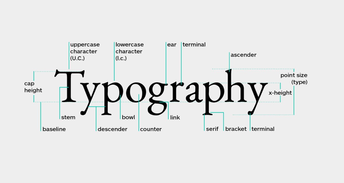
THE MEANING OF TYPEFACE
Falling under the category of typography, the typeface is a key element in the world of typography and design. The method of using the right width, height, baseline, and even the boldness of the text falls under the process of a typeface. It is responsible for choosing the styles and designing of the text itself. It keeps your text consistent and appealing. It would be very weird if all the spacings in this article were different, right? To avoid that from happening designers need to be careful about the typeface.
The main components to be kept in mind when it comes to avoiding spacing and other errors are:
-
Weight:
This refers to the thickness of your words and letters. The ability to change them in different variations like regular, medium, or bold is the magic of typeface!
-
Baseline:
This is where your text fits on a page on an invisible line. This is important to align your text together.
-
X-height:
It is the height and distance between the baseline and your lowercase letter in the body.
-
Cap height:
This is the height and distance between the baseline of your uppercase letter in the body.
-
Spacing:
The spacing between the lines and paragraphs, like that ranging from single to double spacing, also falls under typeface.
Let’s look at some basic types of typeface before we try to better understand the process of typeface!
TYPES OF TYPOGRAPHY AND TYPEFACE
Fun fact: Typefaces have existed for centuries going back to the 1400s. The oldest one is blackletter!
Typefaces are often classified to help convey the writer’s message better. Some of the font styles have also come from handwritten calligraphy, for example, the font of The New York Times. While there are many classifications of typefaces, there are a few types of font styles that work better than the others.
Some of the basic ones are:
-
Serif:
These fonts include extra strokes at the end of each letter. These go back way in history and bring the feelings of tradition, integrity, and culture. The Blackletter font is also a part of serif typefaces.
-
Sans-Serif:
This is specific in a way that most fonts that are not serif, which means fonts that do not have strokes at the end of the letters are sans serif. These are more modern and minimal.
-
Script:
These are cursive fonts. They have fluid strokes and look similar to handwriting. They can be found resembling old Greek writings.
-
Monospaced:
These fonts are called fixed-pitch which refers to the fact that the spacings of these fonts are the same horizontally. It is different from having more options for widths.
-
Display:
These fonts are not used for the body of the content but rather for headings. They’re used for titles and announcements. These are often big and bold since they help catch the reader’s attention in no time!
These are the basic typefaces although if you’re wondering about the difference between fonts and typefaces, you’re about to find out!
DIFFERENCE BETWEEN FONTS AND TYPEFACE
While the font you decide may include a collection of typefaces, the typefaces help you decide the dimensions and sizes of your text.
Fonts are used to simply convey text, while typefaces in fonts can be used to portray emphasis or show the difference in a good manner. Fonts are also more specific than a typeface. In easier terms, a typeface is a group of fonts and font is a subcategory of any particular category of fonts. It is only that fonts are more specified and a part of the typeface. For instance, if the font style Helvetica Neue is your typeface, then the font could be Helvetica Neue regular/light/ medium, etc could be your correct font.
We believe typography is an essential skill as it can help you convey your messages better. Get better at communicating your content and reaching the right audience with our help, enrol for our typography course today!
How can ISDI help:
Are you ready to take a step ahead to learn typography? Learn how to choose the right font styles and make your designs even better!
ISDI offers various design programs such as Graphic Designing, Fashion Design, Fashion Communication and Styling, Strategic Design, Communication Design, Product Design, and Management. Pursuing one of the degree programs, that is, Bachelors in Design (BDes) – 4-year program or Postgraduate In Design (PGDI) – 11 months program. Either of the programs is an alternative to a career in design.
The ISDI campus is located in the business district of Mumbai, the commercial center of India. ISDI consists of a curriculum that is based on that of the Parsons School of Design, experienced and industry-leading faculty, and practical project-based training, all situated on a state-of-the-art campus. ISDI is just the right place for someone looking to start a career in design.
“Form and function together create typographic excellence.”