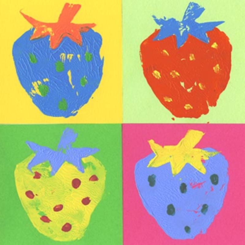
Have you seen this piece? Andy Warhol, a famous American graphic designer, film producer, and director, made it. At a glance, we see four different strawberries, or perhaps it’s the same strawberry painted in four different colour schemes. Either way, nothing special about it, right? Not a big deal? Plain old strawberries? It will surprise you that this piece of art is worth upwards of ten thousand dollars, all the way up to a million!
Andy Warhol was renowned for his pictures of everyday consumerist products or famous figures using screen printing techniques. If you haven’t seen the strawberries, then you might have have seen this one:
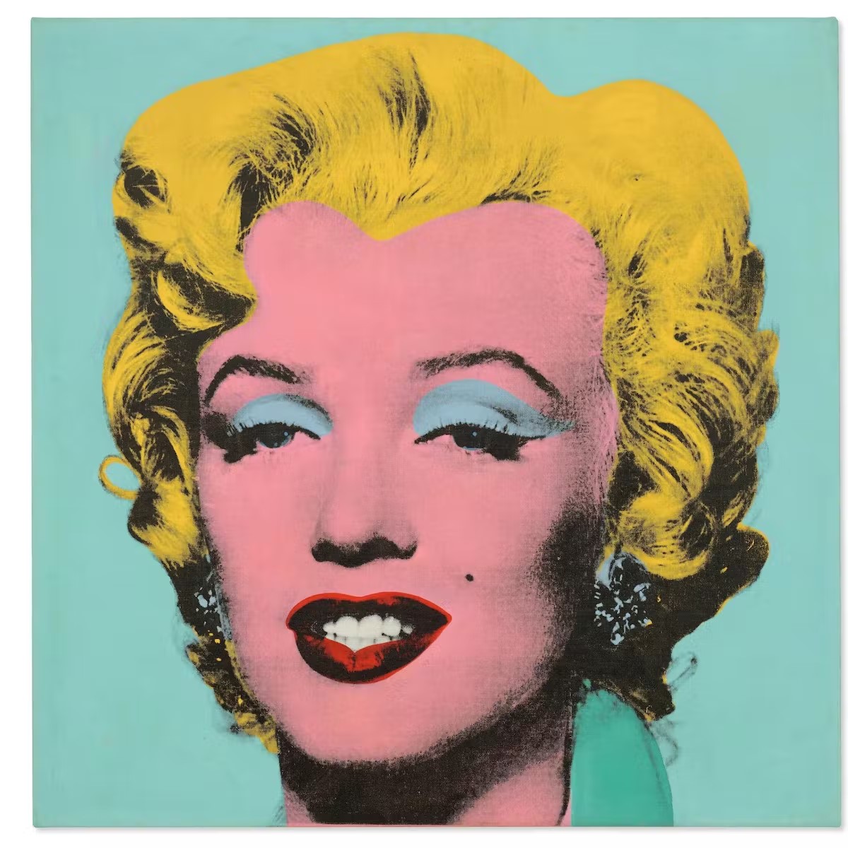
It’s Marilyn Monroe, of course! So, we know what you’re thinking. Why are these pictures so highly valued? What makes Warhol’s work so striking to look at, so highly priced, and so coveted?
Warhol uses a collection of colours for each strawberry, but these are colours that go well together, and because he put together the perfect shades, we see depth in his piece. We can look beyond the strawberries to imagine how each strawberry must taste different.
We’ll find out more about this in the next section, where we learn colour theory, the one tip that makes a picture awe-inspiring. Without further ado, let’s dive right into the importance of colour theory along with a quick guide!
What is Colour Theory?
Colour theory is a set of principles that tells the artist what colours work well and what the effects of seeing some colours together are on the viewer. It’s not as simple as knowing that red and white make pink, but where to use the pink, which other colours to use it with, and how the viewer will feel when they see the pink.
One would think that colours are simple. Light colours make us happy, and dark colours are intense. Then why is there comprehensive literature on something so straightforward? Let us move to the next section to understand the importance of colour theory.
Why is Colour Theory Important?
Before we talk about the importance of colour theory, let’s talk about its two aspects: the right colour combination and the correct colour types.
- Colour combinations- Colours that go well together.
- Suited colour types- Colours that offer details about the art, enhancing the picture by giving it a back story.
Colour theory is necessary because, as an artist, you want to put your emotions on paper, to express yourself. Using the right colours helps you transmit it to the viewer. A painter uses colours to share the deep nuances of their characters. If you have watched children’s television, you will notice how they use bright colour combinations for the heroic characters and dark colour combinations for the morally grey ones.
Similarly, a marketing manager uses graphic art to appeal to the audience and uses harmonious colours to spark emotional reactions. How many times have you seen a beautifully packaged product and wanted to buy it simply because of the packaging? That’s how we all fell for L’Oreal cosmetic products. The beautiful and minimalistic covers entice us even before trying out the merchandise.
If we think about the packaging of Cadbury chocolates and study their marketing, we can see how they use a regal purple to exhibit the grandeur of the product. Companies like Ariel and Tide that sell “cleanliness” don’t use dark, muddy colours on their packaging. It is called strategic design.
Now that we know what colour theory is and why it is essential, we’re going to run you through a quick guide on colour theory!
A Beginner’s Guide To Colour Theory
This subject is rather vast, so one article can’t hope to cover the centuries worth of literature on it. However, we’ll try to go over the most important rules here:
There are a few basic rules to colour theory:
-
Colours and values are different
“Value” is a grey scale between white and black. Each colour you use must have the same proportion of white blended into it to work well with another. So pastels go with pastels, and muddy colours work better with muddy colours.
-
Colour temperatures matter
Some colours are warm, and some are cool. Maintaining a good balance of both in a painting can help convey the overall “feel” of an artwork.
-
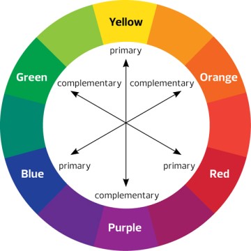
Colour combinations can be determined using a colour wheel
This one is the most important! There are many types of colour combinations:
- Monochromatic- Different shades of a single colour
- Triadic- Adjacent and opposite colours on a colour wheel
- Analogous- Adjacent colours of a colour wheel
- Complementary- Opposite colours on a colour wheel
-
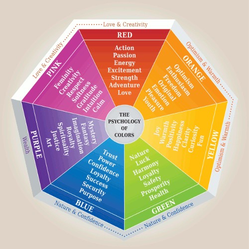
The psychology of colours helps you go that extra mile
Different colours evoke different emotional responses. Red and Pink elicit creativity and passion/ love. Warm colours like Orange and Yellow arouse enthusiasm, optimism, positivity, joy, and so on. Greens stimulate prosperity and nature, while Blue and Violet prompt confidence and royalty. The picture below shows us what responses different shades of each colour bring out.
Do you see how critical colour theory is for any artist? It’s fundamental and complex. That’s why artists often spend years perfecting their knowledge. Renowned painters, from Picasso to Van Gogh, have used colour theory to set themselves apart. How do you pick the right colours? With infinite shades of each colour, how do we decide which colours work with which? These are the questions the principles of colour theory answer.
How can ISDI help:
At ISDI, we teach you how to apply colour theory to create complete and aesthetic pieces. For now, we hope this article was beneficial in giving you a start!
We offer various design programs such as Strategic Design Management, Product Design Fashion Design, Fashion Communication and Styling, Interior Design and Strategic Design, Communication Design, and Management. Pursuing one of the degree programs, that is, Bachelors in Design (BDes) – 4-year program or Postgraduate In Design (PGDI) – 11 months program. Either of the programs is an alternative to a career in fashion and design.
The ISDI campus is located in the business district of Mumbai, the commercial centre of India. ISDI consists of a curriculum that is based on that of the Parsons School of Design, experienced and industry-leading faculty, and practical project-based training, all situated on a state-of-the-art campus. ISDI is just the right place for someone looking to start a career in design.