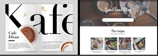
STRATEGIC COMPOSITION
Creative visualization is the most important piece of every success using the power of mind. But how does one communicate these thoughts through an image. Your job is half done if only you follow the basics and use them to your advantage.

1. Typography
While deciding your typeface and creating your font, keep in mind who your readers are. Try and focus on what is essential and eliminate the rest. Less is more. Try and communicate the exact message through minimalist words. The font talks a certain language, make it purposeful.

2. Colours
Colour gives a perpetual identity to the communication. Most of our assessments or for that matter bias is triggered through colours.
Pick a colour scheme that best suits your concept. A simple black and white or play around with a single colour and its hues or get creative and use different colours. However, use a certain approach while finalizing your colours. Be safe and select colours that complement each other. Every colour denotes a standalone significance; understand their traits to utilize the same. Not to forget the importance of each of these colours culturally. Represent it accurately.

3. Composition
If you manage to use these two tools correctly, all you have to do is make it look even more appealing by mere arrangement. Why? Well, you need to establish it to maintain a viewer’s interest (extremely crucial).
Here is the most exciting bit, these tools work best for any sort of composition, apply it to a digital one, a print/ physical one… Use it as your basics for developing a static website, designing a logo, or even while making a card for your father, on Father’s Day.
Thank you and wish you All, a happy New Year!!


Incredible points. Solid arguments. Keep up the good spirit.
Thank you!